Music Video

Music Video
Chloe Barnham- Candidate number: 5021
Showing posts with label Planning. Show all posts

Thursday, 2 December 2010

Possiable fonts for album cover and magazine advert

gI wanted something that looked fun and young, as I felt this was the most fitting for my band. I choose the first font as I felt that it was more interesting then some of the other fonts I had looked at.

Before making my final decision I decided to gather some feedback on which font people who were part of my target audience liked the best. The first and the second one proved to be the most popular and many felt that after seeing my video and learning what type of star image I was trying to create some of the other options for font were too simple. In the end I choose the first font as some of the people I asked said that this one felt more like a bands logo.

Thursday, 25 November 2010

Photoshop

Photoshop is the programme that I am going to use to create my album cover and magazine advert.

The benefits of using this programme is that it is fairly simple to use but there is a number of effects on the programme which will help me create the sort of product that I want to. The programme allows me to alter certain pictures so they can look how I want them to look. It also allows me to easily insert text and create any shapes that I may want to make on my cover. It is also easy to create a digi pack layout that will be easy for me to use and easy for me to create my final product into.

There is also a number of tutorials on youtube.com which will mean there is an outlet for us to find out how to use the programme if we become stuck.

Tuesday, 23 November 2010

Feedback on band name


After finishing my album cover I decided that I needed to gather feedback from my target audience. I asked a number of teenage girls what they thought of my album cover.

The general feedback was that they liked the photographs I had used as it showed us what the stars looked like, essential for the album cover of a new star, who cannot rely on people just going out to buy the album because of the name of the band. They need to know what they look like.

They also like the colours I had used as they tied in with the name of the band, The Cherries, and the name of the album, Envious Eyes. They also liked that on the cover of the album I had used shoes, which was also used in the video.

Some criticism for the cover was that they were not sure if they would have used the same font for the bands name and for the album name. They also felt that I might have put the album title, Envious Eyes, in green as it may have been more fitting with the title.

Monday, 15 November 2010

La Roux Album Cover


This is the album cover to La Roux’s debut album, ‘La Roux’. Like the Little Boots album she is a pop star but is one that is much more creditable as her album has a more dance edge to it. Like a pop star she has used a close up photograph of her and her name is in large white letters. Like a pop star they are selling the album on the artist and what she looks like, although unlike Britney and Christina she isn’t being sold as a ‘girl-next-door’ type but someone with a more rockier edge.

The photograph shows La Roux’s quiff, which the artist has become known for, showing how the album cover is also being used to build on her star image.

With the writing in white it helps the writing stick out from the dark background and it also helps draw attention to the stars name. Like with the Little Boots album, aside from the white the other colours in the album are all dark, again something that sets her apart from other pop stars and gives her a more rockier edge. This is again showing how she is suppose to be a more serious artist compared to other new pop stars.

Saturday, 13 November 2010

Avril Lavigne album cover


This is the album cover to Avril Lavigne’s third album. The reason why I’ve decided to look at this album cover was because whilst she is still a pop star, she has slightly more attitude and more of an edge to the others I have looked at so far. Looking at this cover will help me if I choose to market the duo more like an artist similar to Avril Lavigne as apposed to a star more like Britney Spears.

As with the other solo female pop stars album covers the main aspect of this cover is an image of the star. On the right hand side of the cover is an image of her. She is dressed in the way that we would expect her to look, with long blonde hair and slightly punkier clothing then we have seen on the other stars. Like with the Kelly Clarkson cover we would not expect to see the star dressed in glamorous clothing, therefore the album cover is continuing Lavigne’s star image. Although this album cover is more conventionally pop then her other covers, which were darker, she is still dressed in similar ways to her previous covers.

Her name on the cover is not as large as it is on some of the other albums I have looked at, but the image is big enough so that we know who’s cover it is. On the cover she also has a skull and crossbones but there is pink surrounding the skull, which keeps the logo fitting with the idea that she is a edgier pop star then say Britney Spears and Kylie Minogue.

The background is plain white which would be something that I would consider as it would be a simple look to reproduce but still allows the cover to look a pop cover.

Wednesday, 10 November 2010

Systematics album cover


This is the album cover to Systemanias album, ‘I Say Yeh’. Unlike a typical album cover it does not have a picture of the artists face on the cover and it does not have their name on it, although it does have the name of the album on it. This album cover is similar to the bands other covers in a sense because they also do not appear on the front of other albums and is a close up of a body part, for example on another of their albums there is a close up of men's feet in a pair of high heels.

On the cover is a picture of a hand face painting somebody. The shot is in black and white, with only the sponge in red. The words also keep to this colour scheme, with the ‘I Say’ in white and the ‘yeah!’ in red, showing the relationship between the images and the text. Keeping to this colour scheme in both the text and the image is effective as it makes the few things that are in red stand out. This is something that we have considered doing on our own video and on our album cover.

Sunday, 7 November 2010

Album Cover- Little Boots (Hands)


This is the album cover to Little Boots debut album ‘Hands’. Although Little Boots is more of an dance act, her album cover has still used many of the same conventions that a pop album cover uses. There is a mid/ close up shot of the artist herself, with her name in large letters at the bottom of the album, with the name of the album written smaller underneath her name.

The artist is dressed in a quirky dress, differentiating her from a pop star. The album cover is constructing her star image as being different to that of a pop star and a more credible and unique artist, highlighted through her clothes.

With the writing in white it helps it stick out from the background, but it is still fitting with the colour scheme used in the rest of the cover, as white is also used to draw the circle and triangle, behind Little Boots. The other colours used in this album cover are dark, which are used to make up the stormy background, which shows dark clouds and thunder bolts. This is also something that sets her apart from other pop stars as is if this was a pop star the background is likely to be brighter, especially for a debut album. This is possibly highlighting how whilst her music still has elements of pop music she is a much more serious artist.

From this album cover we have learnt how not all pop album covers have to use bright ‘poppy’ colours but they do really have to have a picture of the artist on.

Thursday, 4 November 2010

Christina Aguilera Album Cover- Hurt

On the front of a pop album you would expect to see a picture of the star and the artists name. This is true of Christina Aguilera, whose album covers all have a picture of her on and her name on the front. With this they are selling the album on what she looks like, and like with her music videos they are trying to build upon her star image that is created both with her music and outside of it. You can also see the evolution of her star image thorough the album covers. On the first album she looks like the typical girl next door, with her blonde hair and with minimal make up on, whilst the next album, ‘Stripped’ is a complete change with her with no top on, long dirty hair and chaps on, whilst the final two albums, ‘Back to Basics’ and ‘Hurt’ are of her with platinum blonde hair and red lipstick and heavy eyeliner on, showing how her transformation.
On the front cover of ‘Hurt’ Christina is sitting in a circus ring. She is trying to show how she has become more theatrical and so has her music. This could be because she is trying to show a complete departure from the music that she has made in the past, but still like her other album she still appears on the front cover. The photograph is taken with a red light shining from behind her, suggesting that the spot light is on her and she is the centre of attention.
The main colour on the album cover is red. The photograph is taken with a red light and there is she has both red lips and red nails. The use of this colour adds drama to the cover and makes the picture seem more theatrical, just like she is trying to portray through the picture.
Looking at these album covers will be helpful when we are creating our own for our video because it has helped us think about the conventions of a album cover for a pop star. The use of one colour is also useful in showing us how a atmosphere can be created through a picture.


Monday, 1 November 2010

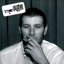
Album cover- Arctic Monkeys (Whatever People Say I Am Thats What I'm Not)

This is the album cover to Arctic Monkeys first album, ‘Whatever people say I am that’s what I’m not’. Whilst this is not the album of a pop band, they still have a close up of a star on the front cover, although on this album it is not a member of the band on the cover. They have used a picture of a person who represents the sort of audience that this album was targeted at, young working class men.

The photograph is taken in black and white, with simply just this one photograph of the man smoking. This album shows how a cover can be very simple but yet effective, as this photograph suggests what the style of music that is on this album is going to be.

This album was taken from the bands first album, and shows how the covers of a rock bands album is different to that of a pop star. If this would have been a pop stars debut album, there would have undoubtedly be a picture of the star on the front as they would have to launch a pop star on the ‘whole package’ rather then just the music, something that a rock band can do.

Wednesday, 27 October 2010

Album covers- The Stone Roses (The Stone Roses) and Pink Floyd (Harvest)


Features of an album cover: Stars face, name of the band, name of the album, connection between the visuals and lyrics, bands logo and record company logo.
Similarities between The Stone Roses and Harvest: Neither of the covers have pictures of the bands on the front. They are relying on the fans of the band recognising the album without having to actually see a picture of the band. For Pink Floyd not appearing on the cover it adds to the mythical nature of the band, they are a band rarely seen and therefore this album add to that star image. The Stone Roses cover is because they were a new band with very little budget. These albums are from bands who are different stages of their career. Both of the covers could suggest something about the music that you are going to hear. They are covers you would expect to see a rock band use rather then a hip hop or pop star use.
 
 The Stone Roses (The Stone Roses) 


Images: Green and white paint splats and lemons. They have kept the album cover simple and have possibly used the quirky feature like the lemons as a way of getting the album noticed rather then having the band on the front cover. The red white and blue is a reference to the French flag, symbolizing the French Unrest in 1968, showing that the band were interested in their being a deeper meaning to their music.
Text: Bold Gold text in the centre, dominating the cover. This could have been done to replace the image of the band, if they are not on the cover at least we know their name.
Relationship between the text and the image: There is both lemons in the text and the image. There is also the relationship between the text and the image because both the text and images are what we possibly expect to see from a rock band. The lemons used in the text and the image also link back to the use of the French flag on the cover. The lemons were used by the people involved in the riots in France, in particular Paris, as a way of protecting themselves from the tear gas. By using symbols that have a stronger more meaningful message it helps assert that they are an indie band.
Functions: In the sleeve of the album cover there is pictures of the band in black and white and they are performing. This could be to reinforce the fact that they are a rock band, who play all their own music. The album sleeve also serves the function of telling us who wrote the songs, produced them, played on them, sung them etc. The fact that the name of the band is big on the album cover could be to replace the fact there is no picture of the band and to get us familiar with the name. The unction of the back of the case is to tell you the name of the songs, helpful if you know the band for one particular song and are looking for it on that album.
Iconography:
There is a union jack on the inside of the cover, signifying that this is a British band. This could also be playing on the traditions of other rock bands such as The Rolling Stones, who also use the Union Jack iconography.

Saturday, 23 October 2010

Kelly Clarkson album cover- All I Ever Wanted

This is Kelly Clarkson’s album cover. The reason that I’ve decided to look at this album cover is because she is a young pop star, which is what our band are. There are very few female duo pop acts but by looking at solo female pop stars we will get a better idea as to the style of album cover we should create as the albums of a solo female and a female duo is likely to be similar as they are both singing the same genre of music and both trying to attract the same target audience.

This album cover is fairly simple. Like we have seen with the other covers Clarkson features on the cover, with the image dominating the cover. In the image she is wearing fairly casual clothes. This would be something that we would be more likely to do for our cover, mainly because of the budget we have to shoot for our cover. The relaxed costume on the front cover fits in with Kelly Clarkson’s star image because she is not known for looking overly glamorous and she isn’t known for having front covers which are particularly artistic or overly original, tending to stick to simple album covers.

This album cover also features her name on the cover, rather bold and large so that we instantly know whose album this is. The name has proved to be a key feature on the cover of a pop album, meaning that when it comes to creating our album cover we need to have a bold title.

This cover also uses simple block colour in the background. This style would be something that we would consider because it would be a simple look to achieve but would still look effective and still make the album distinctively pop. Colour has also proved key on our cover.

Wednesday, 20 October 2010

Kylie Minogue Album cover- X


 This is the album cover to Kylie Minogue’s album X. We looked at this album cover because we wanted to look at how pop stars were represented on their album covers, as this is the genre that our video would fit into. As you would expect on this album cover there is a close up of the artist and her name. This is similar to other albums by Kylie Minogue, although of which have a photograph of her and her name as the biggest writing on the album cover, bigger then that of the albums title if it even includes the title at all. This is because they are relying on selling the album on the name of the already well established artist who can be recognised by her first name only. When creating our album cover we feel it is important to have the artists face on it as this is typically what would be expected from a pop band.

Although the background is black there is still a lot of block bold colour on this album cover, suggesting that pop album need to be colourful to play on the market that they are being targeted at, young women. The red line used in the image also matches the red on her nails and lips. This is something that we will take into consideration when creating our album cover.

In this album there is some relationship between the image and the writing as the writing uses the same colours as her name and the way the colour has been used in the image and the writing is similar.

Friday, 15 October 2010

Final Cut express

Final Cut Express is the programme that we are going to use to edit together the video.

The benefits of using this programme is that it is simple to use, which will make it easier for us when it comes to editing our video. It is easy to duplicate shots and put in and out points, so that we can select the parts of each clip that we want to use without difficulty.

The programme also makes it easy for us to put effects on certain shots, something that is going to be useful for our video as we plan to use many effects, so that the video is in keeping with the song and the previous Rogue Traders video to ‘Voodoo Child’.

The programme also allows us to put the videos into different ‘bins’, which will help us organise the many shots that we are likely after shooting.

The programme also allows us to export the video easily when it is finally finished, meaning we are able to up load the video to our blogs and other internet sites.

There is also a number of tutorials on youtube.com which will mean there is an outlet for us to find out how to use the programme if we become stuck.

Thursday, 7 October 2010

Kate Bush Album Cover


This is the video to Kate Bush's album the red shoes. This cover with the single image of the shoes, the artist name and name of the album is something that we would consider for our artist. We liked the idea of using shoes on our album cover as they are something that we want as a running theme throughout our video and would therefore be something that we would consider then using on our album cover in the future.

On this album cover there is a relationship between the text and the image used as the album is caused 'The Red Shoes' and there is a pair of red shoes on the album cover. The problem with not using an artists face on the album cover is that the CD may not be recognised as quickly as if they were, this is ok for an established artist like Kate Bush, but when it comes to a new artist you are likely to have their face on it so that we get to know them and so that a 'star-image is built up of the artist'.