Tuesday 30 November 2010
Monday 29 November 2010
Possiable pictures for album cover.


These were some of the photos that I collected in preparation for making my album cover. I was fairly sure that I wanted to use shots from the video so that my products tied in with each other. I was also keen to use shots from a particular section of my video because it was the only part when we were both dressed as ourselves rather then in characters.
These were some of the shots that I gathered from my video and decided that before starting my album cover I would ask for feedback on the few shots I had selected from my target audience. They decided that the first two shots were the best ones to use for the cover as you had a clear view of their face, which is what I needed for an album cover. They also liked that I had taken shots from my video as it meant my products would tie in with each other. They said it was distinctively from my video also as I had used the same effects on the photograph as I had in the video.
Saturday 27 November 2010
Independent record labels
Cherry Red: This is a London based record label which was set up in 1978. The company started off promoting rock concerts in 1971 and then in 1978, following a boom in independent record labels following the punk rock movement the company began releasing records. The first single released by the company was Bad Hearts by a local punk band called The tights, in June 1978. Early material released by the company included work by The Hollywood Brats, Destroyer All Monsters and The Runaways. The sales of Dead Kennedys album, Fresh Fruit For Rotting Vegetables, put the company in a good position financially and allowed them to develop to the next stage.
They have marketed other smaller record labels including Heartbreak Records and Glaxo Babies.
As of the late 1980s the company has focused on reissuing records for artists such as Latoya Jackson, Marc Bolan and Toyah.
Music released by the company now tends to focus around hip hop and soul.
Warp records:
Epitaph:
Fueled by Ramen:
This label was started by Vinnie Fiorello, the guitarist from Less Than Jake, and John Janick in 1996. Most releases from this label are Punk-Pop and they released early work by Fall Out Boy, Jimmy Eat World and Yellowcard. Artists currently signed to the label Panic! At the Disco. Was founded in 1980 by Brett Gurewitz, the Bad Religion guitarist. The label mainly releases punk albums and in the 1990’s they released tracks from bands such as The Offspring and Rancid. Artist signed to the label today include The Distillers, Dropkick Murphys and Matchbook Romance. The label aims to be artist-friendly.
Thursday 25 November 2010
Photoshop
Photoshop is the programme that I am going to use to create my album cover and magazine advert.
The benefits of using this programme is that it is fairly simple to use but there is a number of effects on the programme which will help me create the sort of product that I want to. The programme allows me to alter certain pictures so they can look how I want them to look. It also allows me to easily insert text and create any shapes that I may want to make on my cover. It is also easy to create a digi pack layout that will be easy for me to use and easy for me to create my final product into.
There is also a number of tutorials on youtube.com which will mean there is an outlet for us to find out how to use the programme if we become stuck.
Tuesday 23 November 2010
Feedback on band name

After finishing my album cover I decided that I needed to gather feedback from my target audience. I asked a number of teenage girls what they thought of my album cover.
The general feedback was that they liked the photographs I had used as it showed us what the stars looked like, essential for the album cover of a new star, who cannot rely on people just going out to buy the album because of the name of the band. They need to know what they look like.
They also like the colours I had used as they tied in with the name of the band, The Cherries, and the name of the album, Envious Eyes. They also liked that on the cover of the album I had used shoes, which was also used in the video.
Some criticism for the cover was that they were not sure if they would have used the same font for the bands name and for the album name. They also felt that I might have put the album title, Envious Eyes, in green as it may have been more fitting with the title.
Saturday 20 November 2010
Feedback on Rough Cut
I showed my rough cut to a number of people who were part of my target audience. Although it was not finished I wanted an ideas as to what people felt was working in the video and what wasn’t.
People liked the effects used on the shots of Eve walking up towards the camera, which panned down towards her feet as it was fitting for the song because it showed that we were focusing on her clothes and shoes.
They also like the split screen of the different coloured shoes as it looked good visually and also how they appeared fitted in with the beat of the music.
It was however felt that I needed to cut back to scenes in the church as to show that the girl was worshipping the shoes. It was also suggested that I put some effects on the shots as I had used effects through out the video except for on these shots.
I also need to work on the shots of us in the bedroom as they did not feel they fitted in with the rest of the video. I already knew this and did not plan to leave the shots like this, I was simply plotting the clips I would use for the lip-synching.
Wednesday 17 November 2010
Rough Cut
This is the rough cut of my music video. It is not yet finished but wanted to gather feedback from my target audience on what they thought about it so far, so that I could bee what they felt was working and what was not.
So far I’m fairly pleased with the overall look of my video and I feel that I am achieving the look that I set out to create and it fit’s the conventions of a pop music video well. I’m pleased with the feel that the effects are adding to the different shots but at this point am worried that if I continue to use to many then the video will be overloaded with special effects.
At the moment I am particularly pleased with the scenes of Eve walking. I feel that they fit to the beat of the music well and are useful at establishing what the song and the video are about. I am also fairly pleased with the shots in the church however feel that I may need to add some effects to these, although as I have already said I am worried about adding too many.
I’m not happy with the shot where there is two shots of Eve walking towards the camera and they are moving around. I may remove the motion paths when it comes to my final edit. There are also a few issues with lip-synching that I need to work out before my final edit.
Monday 15 November 2010
La Roux Album Cover

This is the album cover to La Roux’s debut album, ‘La Roux’. Like the Little Boots album she is a pop star but is one that is much more creditable as her album has a more dance edge to it. Like a pop star she has used a close up photograph of her and her name is in large white letters. Like a pop star they are selling the album on the artist and what she looks like, although unlike Britney and Christina she isn’t being sold as a ‘girl-next-door’ type but someone with a more rockier edge.
The photograph shows La Roux’s quiff, which the artist has become known for, showing how the album cover is also being used to build on her star image.
With the writing in white it helps the writing stick out from the dark background and it also helps draw attention to the stars name. Like with the Little Boots album, aside from the white the other colours in the album are all dark, again something that sets her apart from other pop stars and gives her a more rockier edge. This is again showing how she is suppose to be a more serious artist compared to other new pop stars.
Saturday 13 November 2010
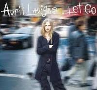
Avril Lavigne album cover

This is the album cover to Avril Lavigne’s third album. The reason why I’ve decided to look at this album cover was because whilst she is still a pop star, she has slightly more attitude and more of an edge to the others I have looked at so far. Looking at this cover will help me if I choose to market the duo more like an artist similar to Avril Lavigne as apposed to a star more like Britney Spears.
As with the other solo female pop stars album covers the main aspect of this cover is an image of the star. On the right hand side of the cover is an image of her. She is dressed in the way that we would expect her to look, with long blonde hair and slightly punkier clothing then we have seen on the other stars. Like with the Kelly Clarkson cover we would not expect to see the star dressed in glamorous clothing, therefore the album cover is continuing Lavigne’s star image. Although this album cover is more conventionally pop then her other covers, which were darker, she is still dressed in similar ways to her previous covers.
Her name on the cover is not as large as it is on some of the other albums I have looked at, but the image is big enough so that we know who’s cover it is. On the cover she also has a skull and crossbones but there is pink surrounding the skull, which keeps the logo fitting with the idea that she is a edgier pop star then say Britney Spears and Kylie Minogue.
The background is plain white which would be something that I would consider as it would be a simple look to reproduce but still allows the cover to look a pop cover.

Wednesday 10 November 2010
Systematics album cover

This is the album cover to Systemanias album, ‘I Say Yeh’. Unlike a typical album cover it does not have a picture of the artists face on the cover and it does not have their name on it, although it does have the name of the album on it. This album cover is similar to the bands other covers in a sense because they also do not appear on the front of other albums and is a close up of a body part, for example on another of their albums there is a close up of men's feet in a pair of high heels.
On the cover is a picture of a hand face painting somebody. The shot is in black and white, with only the sponge in red. The words also keep to this colour scheme, with the ‘I Say’ in white and the ‘yeah!’ in red, showing the relationship between the images and the text. Keeping to this colour scheme in both the text and the image is effective as it makes the few things that are in red stand out. This is something that we have considered doing on our own video and on our album cover.
Sunday 7 November 2010
Album Cover- Little Boots (Hands)

This is the album cover to Little Boots debut album ‘Hands’. Although Little Boots is more of an dance act, her album cover has still used many of the same conventions that a pop album cover uses. There is a mid/ close up shot of the artist herself, with her name in large letters at the bottom of the album, with the name of the album written smaller underneath her name.
The artist is dressed in a quirky dress, differentiating her from a pop star. The album cover is constructing her star image as being different to that of a pop star and a more credible and unique artist, highlighted through her clothes.
With the writing in white it helps it stick out from the background, but it is still fitting with the colour scheme used in the rest of the cover, as white is also used to draw the circle and triangle, behind Little Boots. The other colours used in this album cover are dark, which are used to make up the stormy background, which shows dark clouds and thunder bolts. This is also something that sets her apart from other pop stars as is if this was a pop star the background is likely to be brighter, especially for a debut album. This is possibly highlighting how whilst her music still has elements of pop music she is a much more serious artist.
From this album cover we have learnt how not all pop album covers have to use bright ‘poppy’ colours but they do really have to have a picture of the artist on.
Thursday 4 November 2010
Christina Aguilera Album Cover- Hurt
On the front of a pop album you would expect to see a picture of the star and the artists name. This is true of Christina Aguilera, whose album covers all have a picture of her on and her name on the front. With this they are selling the album on what she looks like, and like with her music videos they are trying to build upon her star image that is created both with her music and outside of it. You can also see the evolution of her star image thorough the album covers. On the first album she looks like the typical girl next door, with her blonde hair and with minimal make up on, whilst the next album, ‘Stripped’ is a complete change with her with no top on, long dirty hair and chaps on, whilst the final two albums, ‘Back to Basics’ and ‘Hurt’ are of her with platinum blonde hair and red lipstick and heavy eyeliner on, showing how her transformation. 


On the front cover of ‘Hurt’ Christina is sitting in a circus ring. She is trying to show how she has become more theatrical and so has her music. This could be because she is trying to show a complete departure from the music that she has made in the past, but still like her other album she still appears on the front cover. The photograph is taken with a red light shining from behind her, suggesting that the spot light is on her and she is the centre of attention.
The main colour on the album cover is red. The photograph is taken with a red light and there is she has both red lips and red nails. The use of this colour adds drama to the cover and makes the picture seem more theatrical, just like she is trying to portray through the picture.
Looking at these album covers will be helpful when we are creating our own for our video because it has helped us think about the conventions of a album cover for a pop star. The use of one colour is also useful in showing us how a atmosphere can be created through a picture.


Monday 1 November 2010
Album cover- Arctic Monkeys (Whatever People Say I Am Thats What I'm Not)
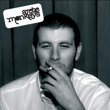
This is the album cover to Arctic Monkeys first album, ‘Whatever people say I am that’s what I’m not’. Whilst this is not the album of a pop band, they still have a close up of a star on the front cover, although on this album it is not a member of the band on the cover. They have used a picture of a person who represents the sort of audience that this album was targeted at, young working class men.
The photograph is taken in black and white, with simply just this one photograph of the man smoking. This album shows how a cover can be very simple but yet effective, as this photograph suggests what the style of music that is on this album is going to be.
This album was taken from the bands first album, and shows how the covers of a rock bands album is different to that of a pop star. If this would have been a pop stars debut album, there would have undoubtedly be a picture of the star on the front as they would have to launch a pop star on the ‘whole package’ rather then just the music, something that a rock band can do.
Subscribe to:
Posts (Atom)